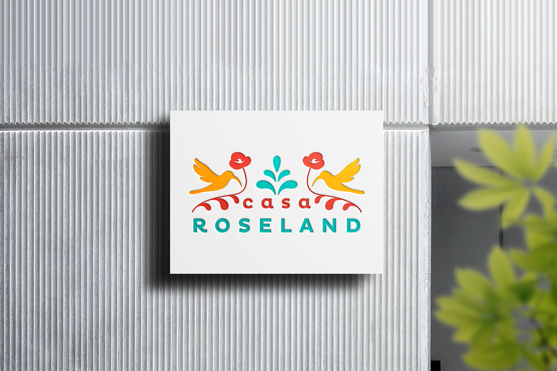
Displayed in this brand you will find an evocation to a classic “papel picado” ornament
that also resembles an Otomí (native culture) pattern, used in embroidery and other artcrafts.
that also resembles an Otomí (native culture) pattern, used in embroidery and other artcrafts.
The birds are related to homes and to nests, also connected to flowers and nature.
This composition reveals a symmetrical brand, a characteristic of papel picado structures and also represents colaboration, unity and reciprocity.
The round Sans Serif makes this image more friendly, family oriented. Gives a sense of
happiness.
happiness.
While the colors are bright red like a Latina American sun, yellow as the corn and blue as the sky.
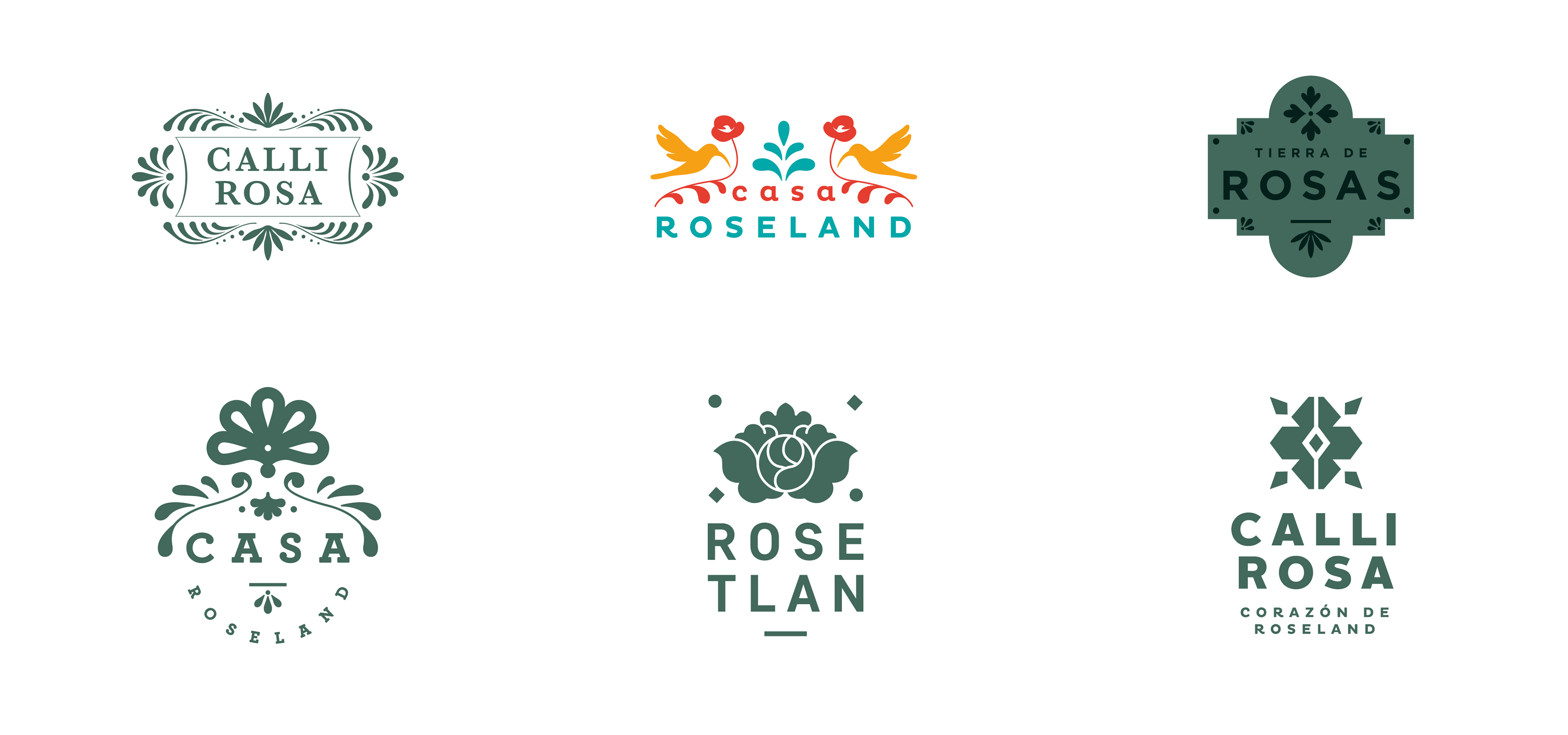
Watza created four possible new names accompanied by five logos. Each of them bringing meaning and power to this new Northern California neighborhood with 175 housing units.
On December 4, the community cast their votes in a public meeting at the Roseland Community Library to choose the winning name and logo.