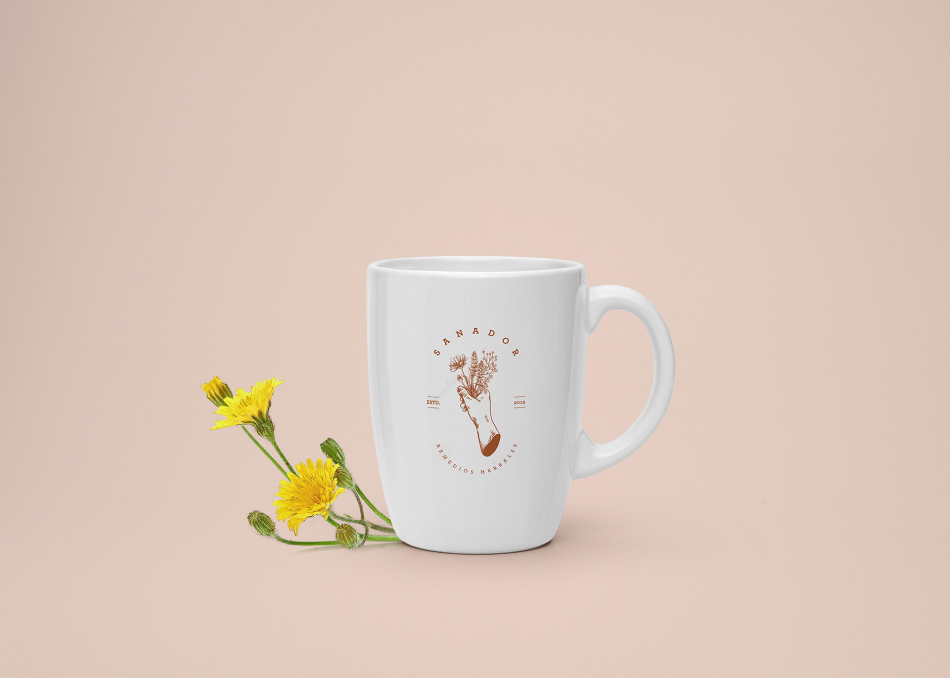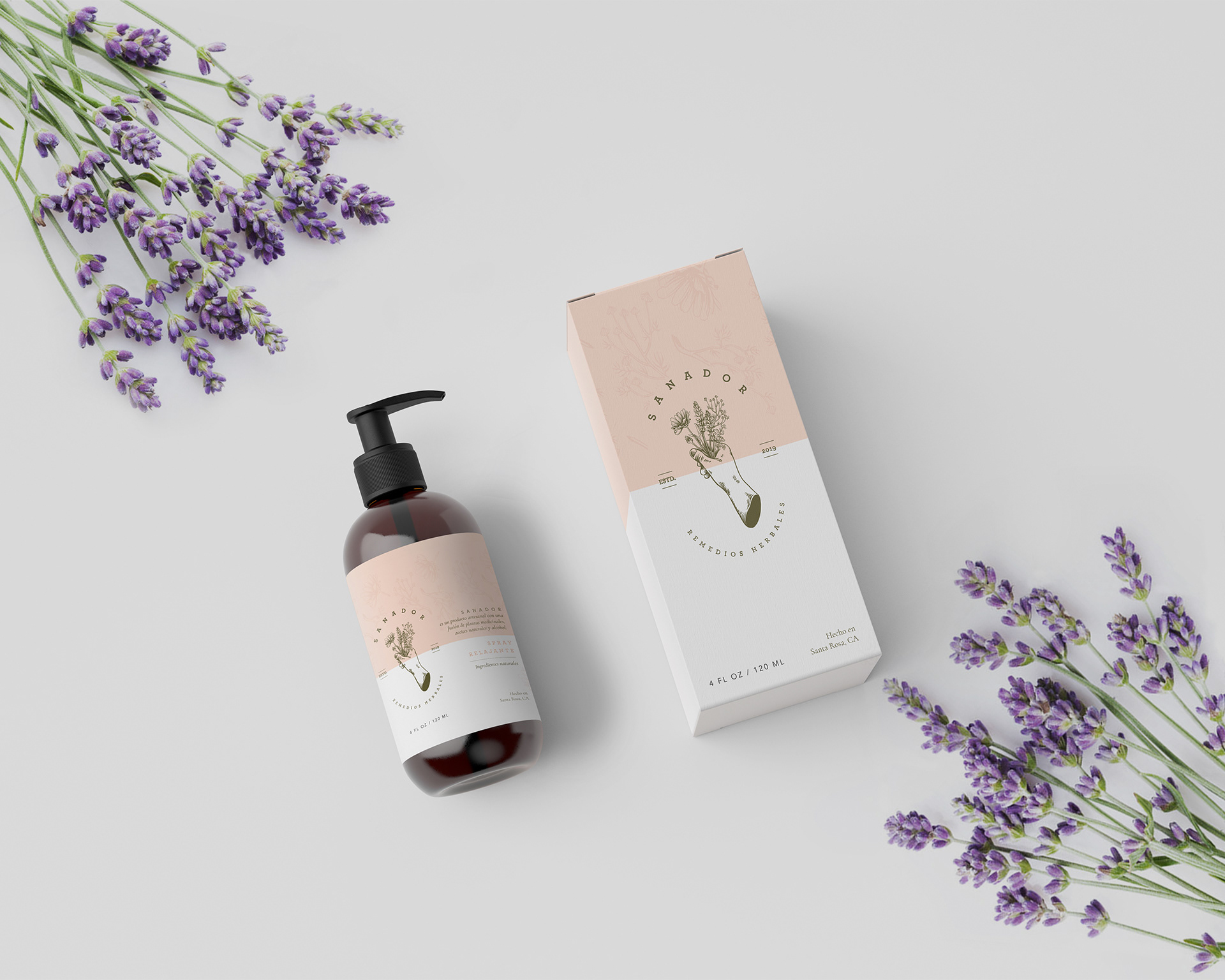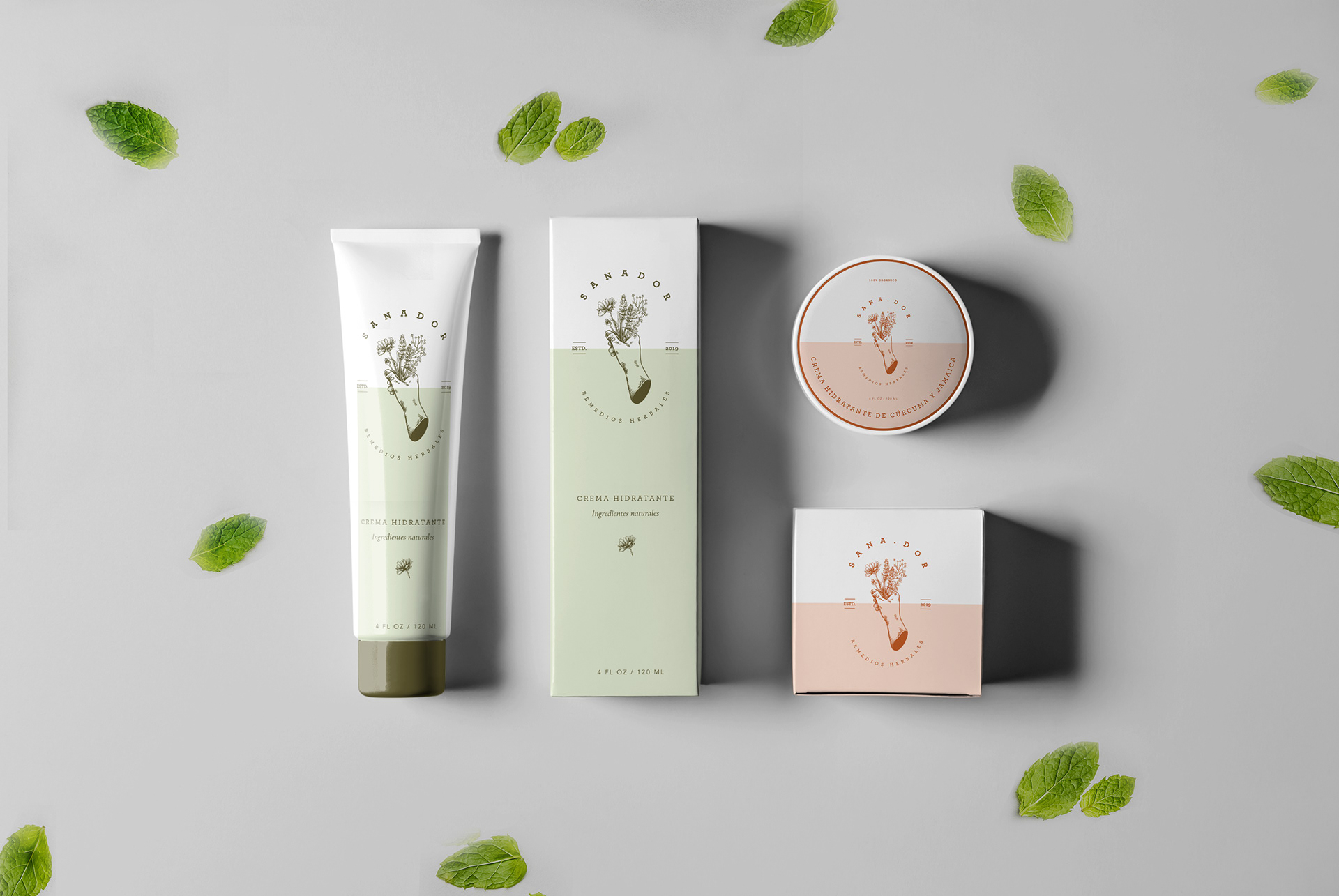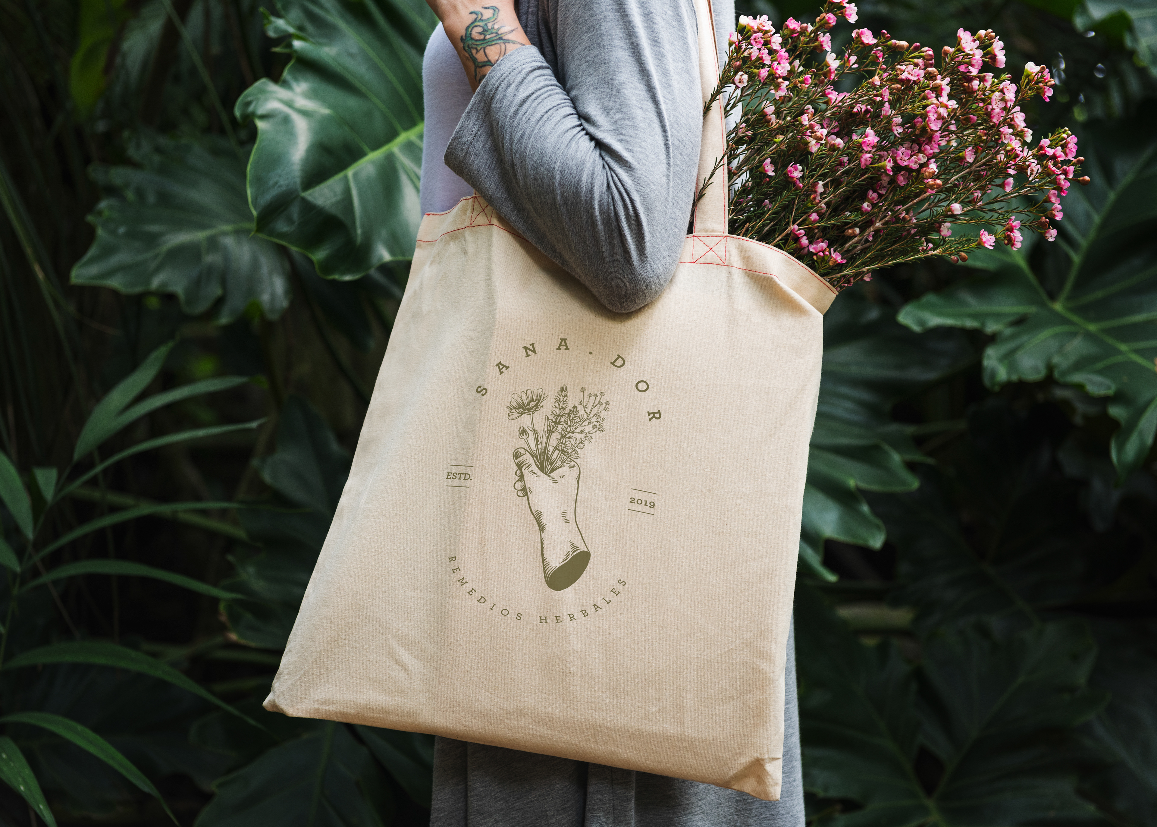
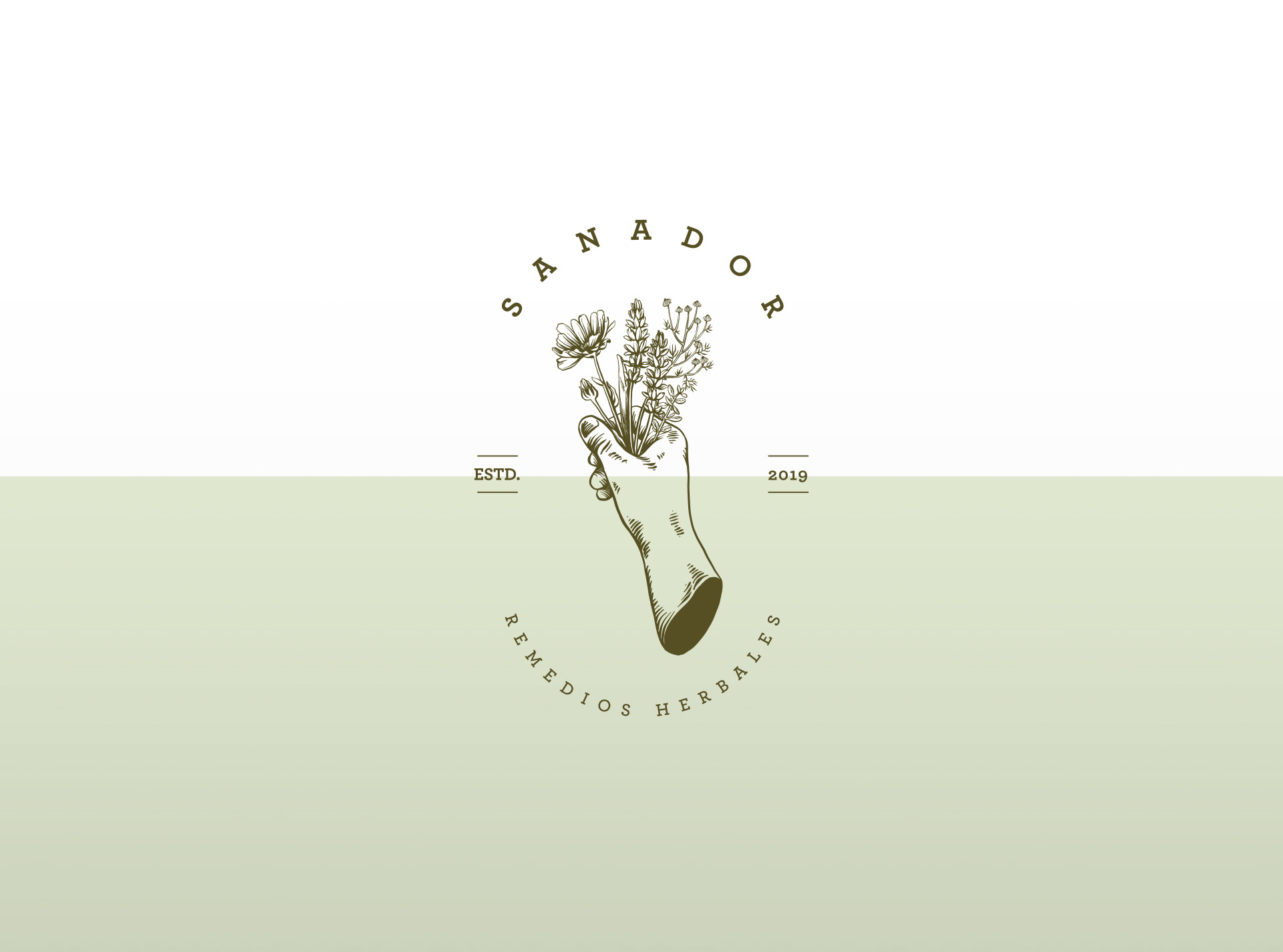
The shaman and the medicinal plants — the hand that heals.
This logo shows directly what the brand offers as a product: herbal remedies.
An (asexual) hand holds a bunch of herbs (lavender, chamomile, thyme, and calendula).
The curved, stamp-style composition honors this ancient craft by referencing 19th-century stamps.
The Serif typeface provides an elegant and sophisticated image to the brand, while safeguarding the concept of security through the use of straight and strong Serifs.
A mixture of two colors was used, ocher orange and olive green. Both of low saturation referring to the natural tone of the dehydrated herbs.
The pastel tones give the brand a touch of tranquility and softness.