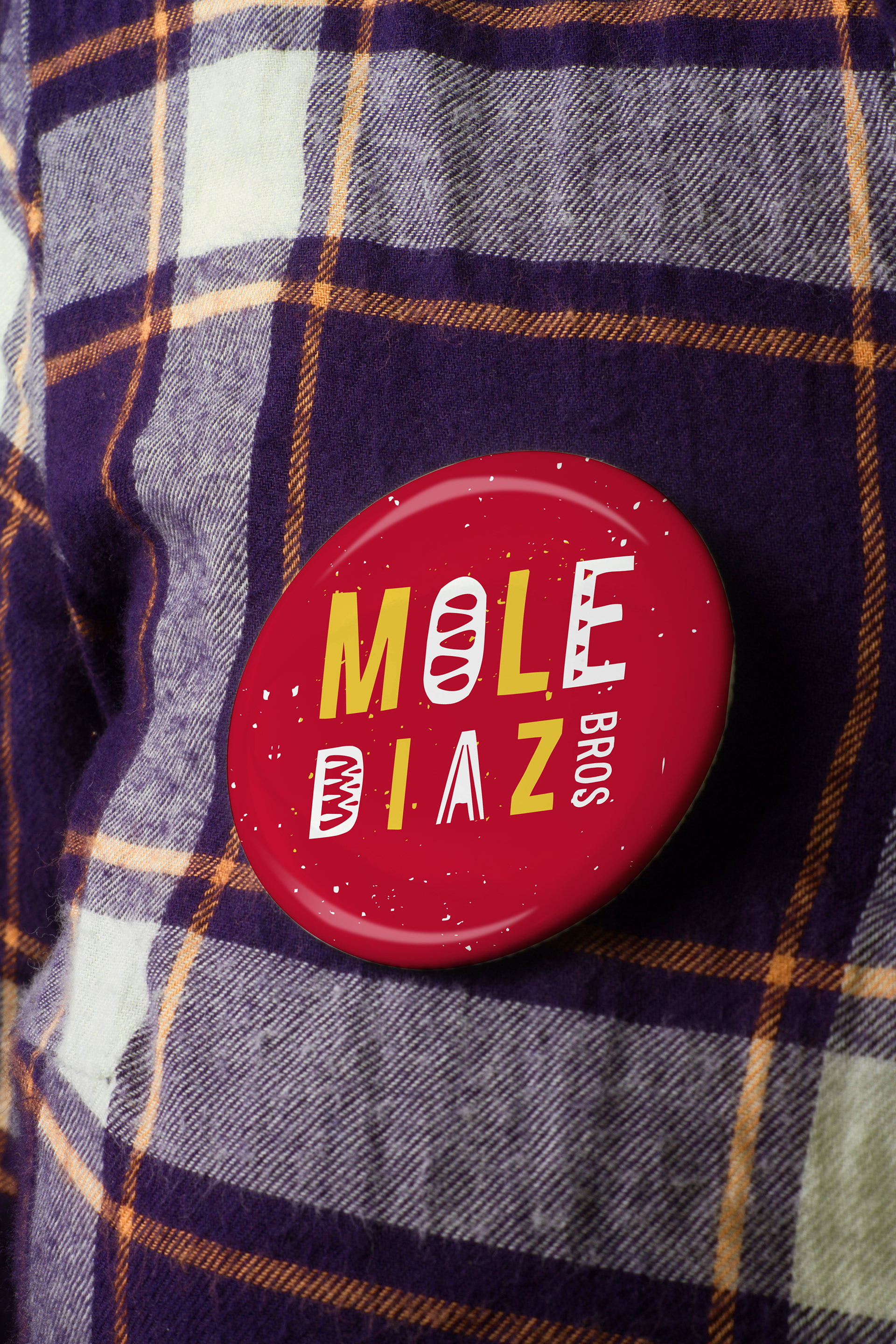
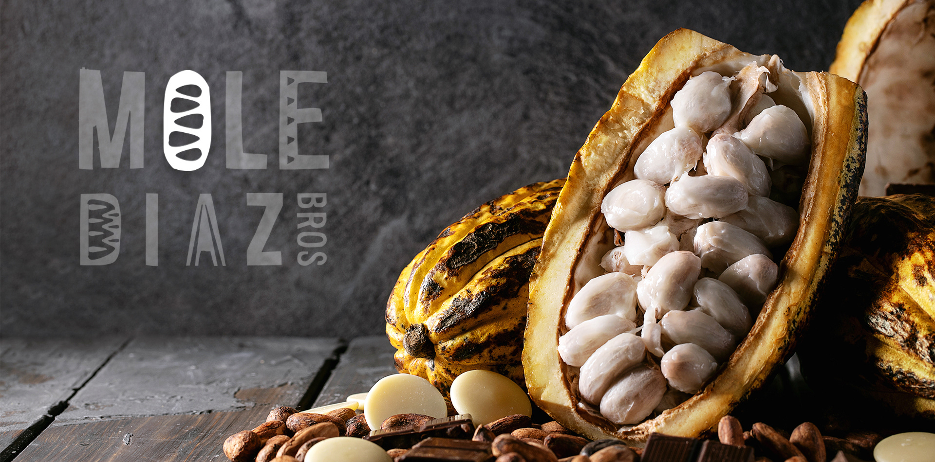
The logo is a modern representation of Mexican traditions.
The irregular lines and the screen-printed texture convey the artisanal concept of the Mole creation process. Certain characters of the brand abstractly include figures of both the fruit and the cocoa bean.
The shapes of the elements were inspired by the lines of traditional Mexican ceramics ("talaveras" and clay) representing the "mestizo" culture of Mexico.
The composition of the logo conveys innovation through the vertical implementation of the third word “bros”, producing an avant-garde visual contrast.
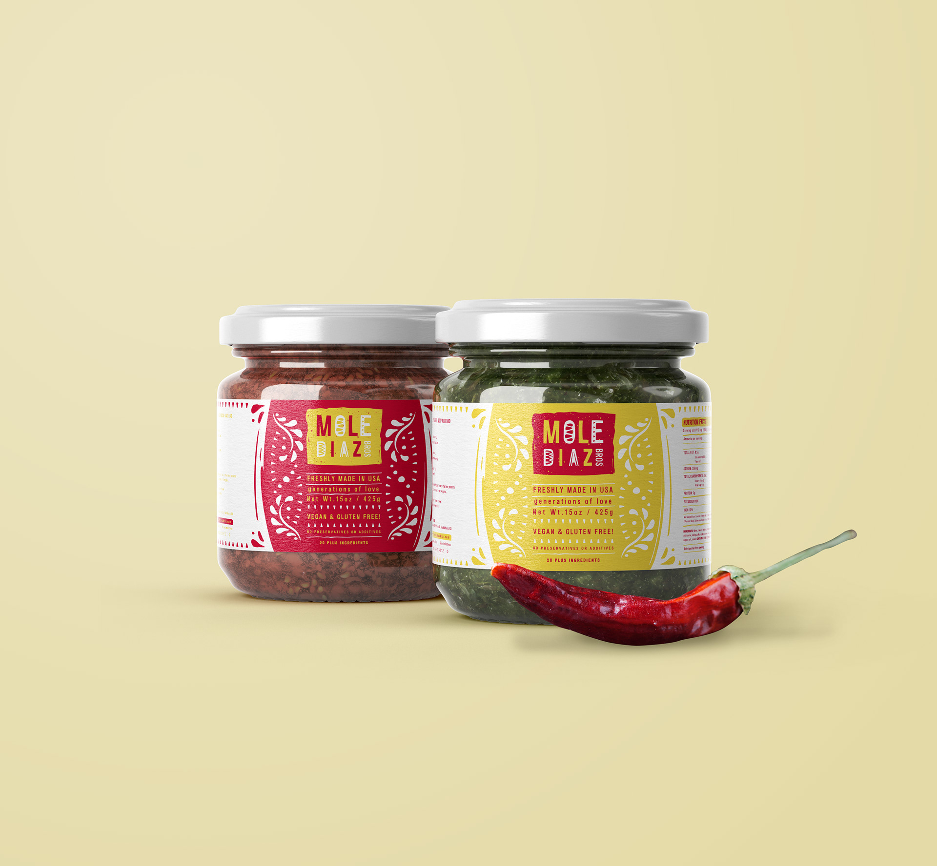
Red psychologically is statistically associated with the food industry. Its warm tones whet the appetite and generate a feeling of happiness.
The color yellow was chosen because of its high contrast with red, and its positive association with innovation and joy. The two apparently primary colors represent Mole: a simple dish with a complex foundation.
A brand made up of two colors has the advantage of generating less environmental impact at the time of its reproduction and a lower economic cost for certain methods of impression.