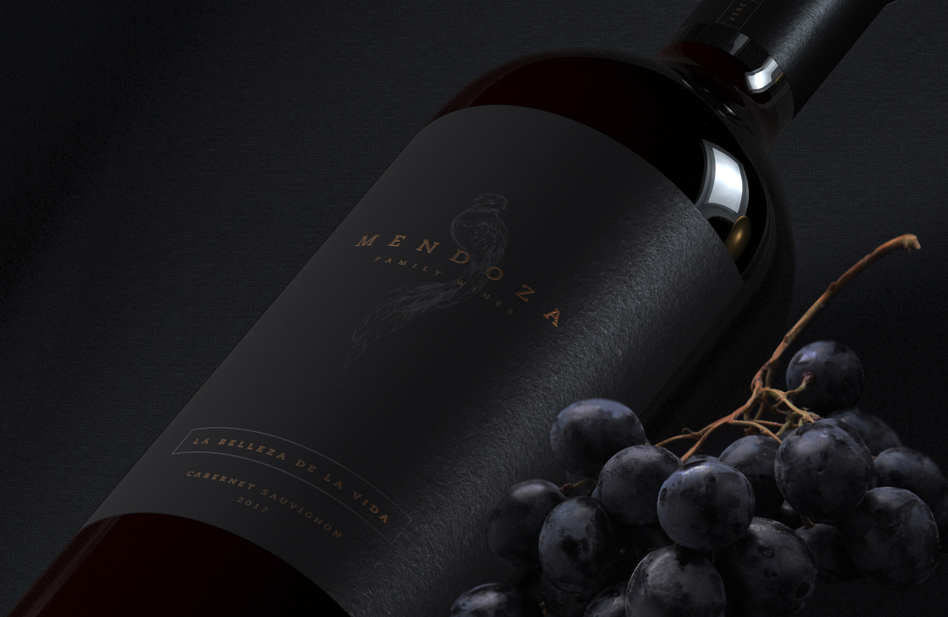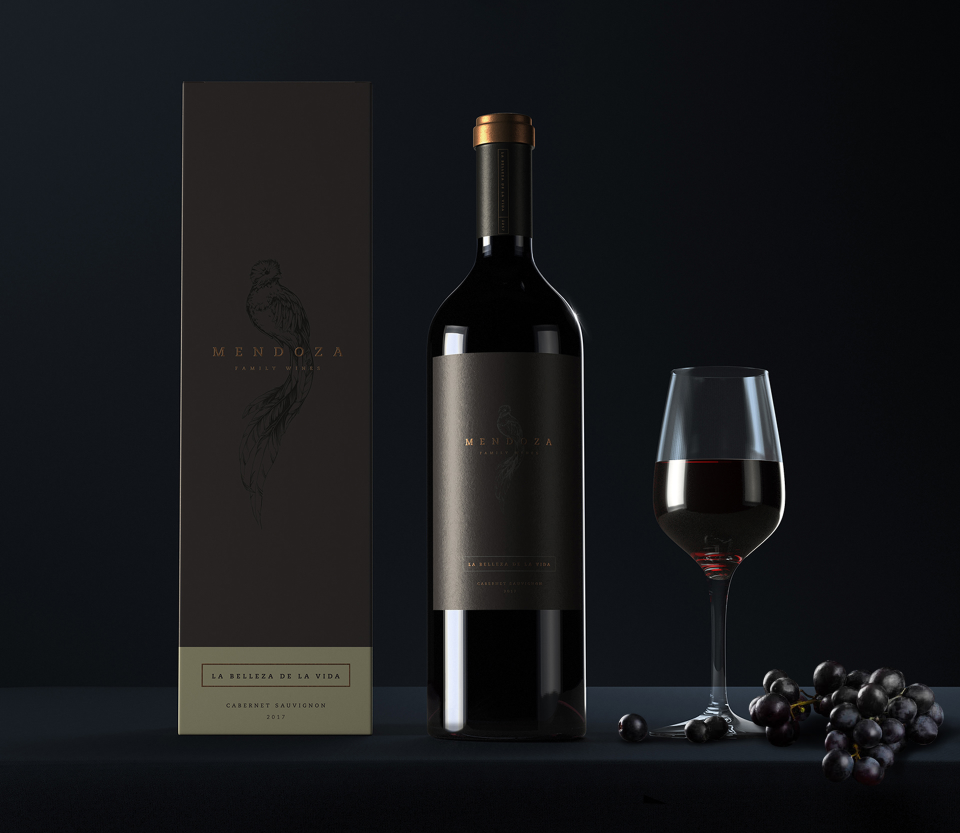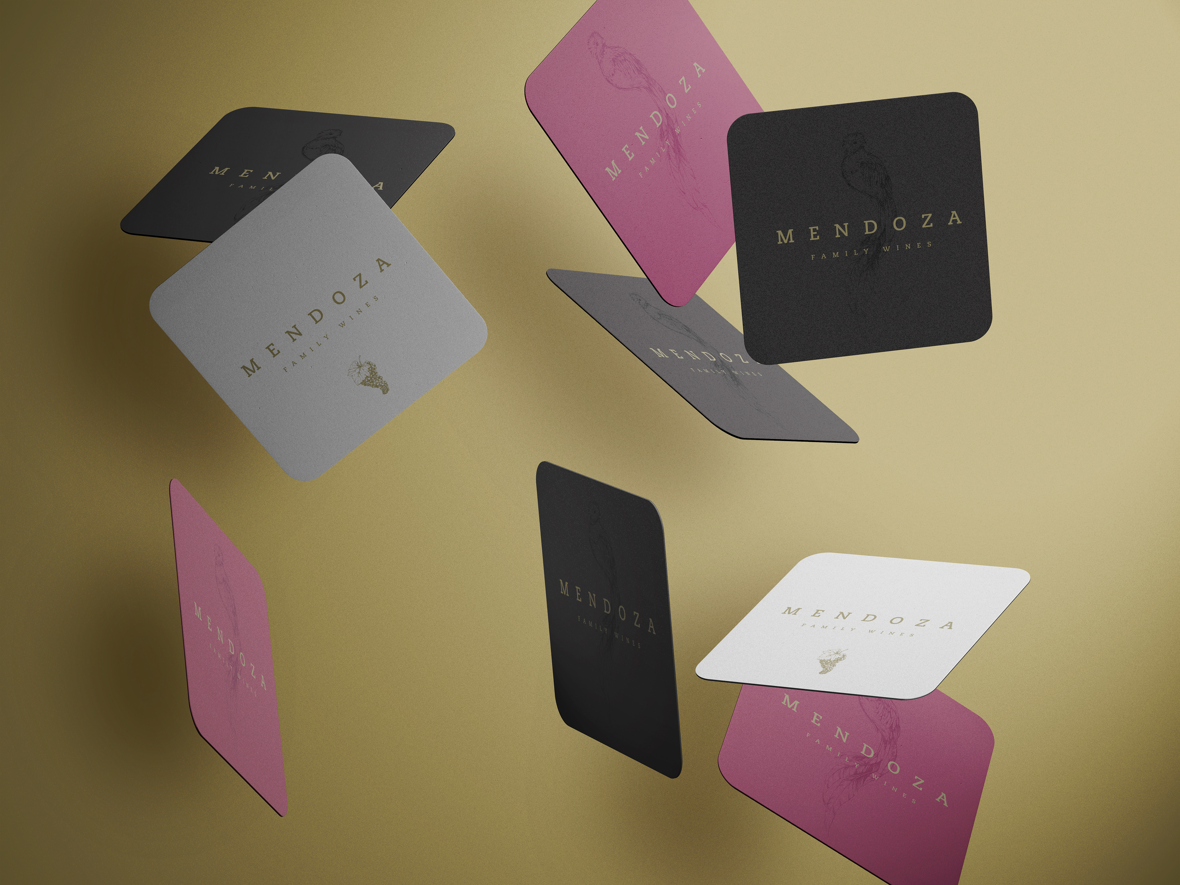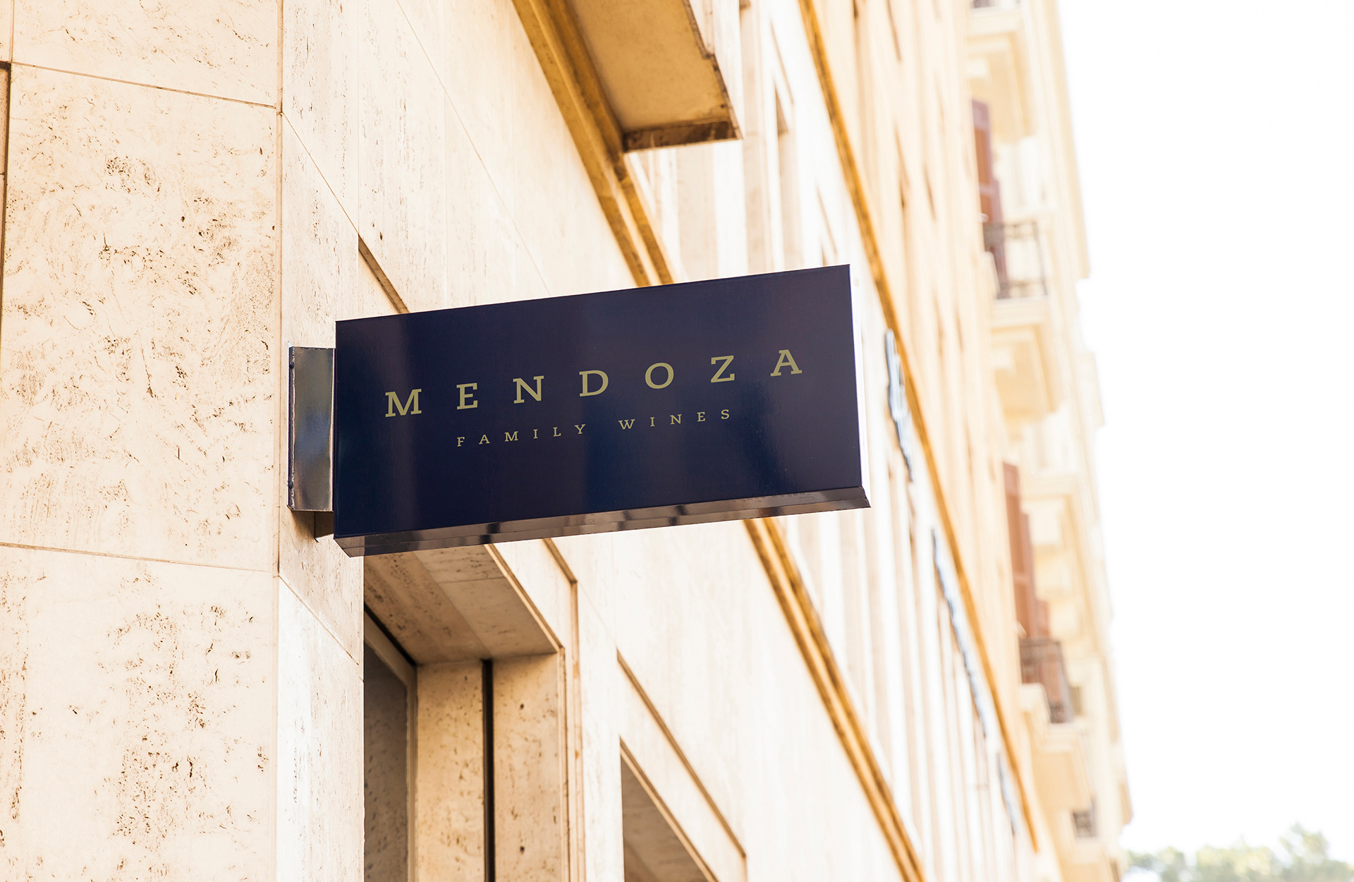
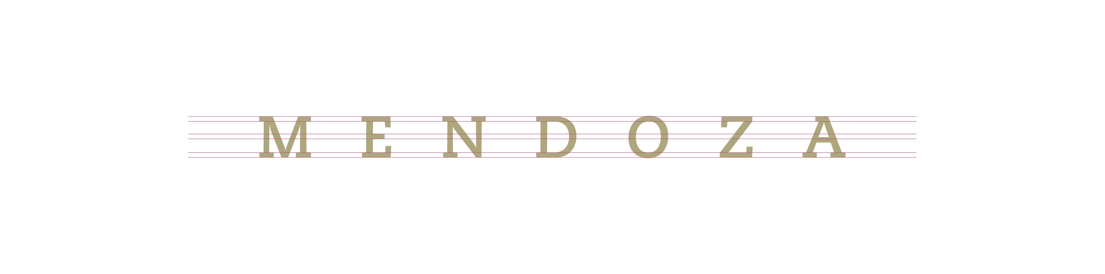
Mendoza is a typographic logotype that reflects modern elegance. Based on a geometric style Slab Serif font, Caecilia was originally designed by dutch designer Peter Mathias Noordziji.
The font builds on a long history of slab serifs, beginning in the early 19th century when
designers began to play with the proportions of letters and the shapes of Serifs to create
interesting fonts for advertising.
designers began to play with the proportions of letters and the shapes of Serifs to create
interesting fonts for advertising.
In this logo, the space between letters, allows the wind to pass through and gently lay down in the bottom label that dictates the brand context.
The color palette is a calm grayscale palette that reflects the maturation of the brand, with a touch of a gold tint to reflect elegance and sophistication.
As a complementary graphic, a majestic Quetzal adds a hint of the family origins of
Guatemala.
Guatemala.