
Entrepreneur Damián Zúñiga had the idea to serve Mexican-style dishes with two main ingredients — fish and meat.
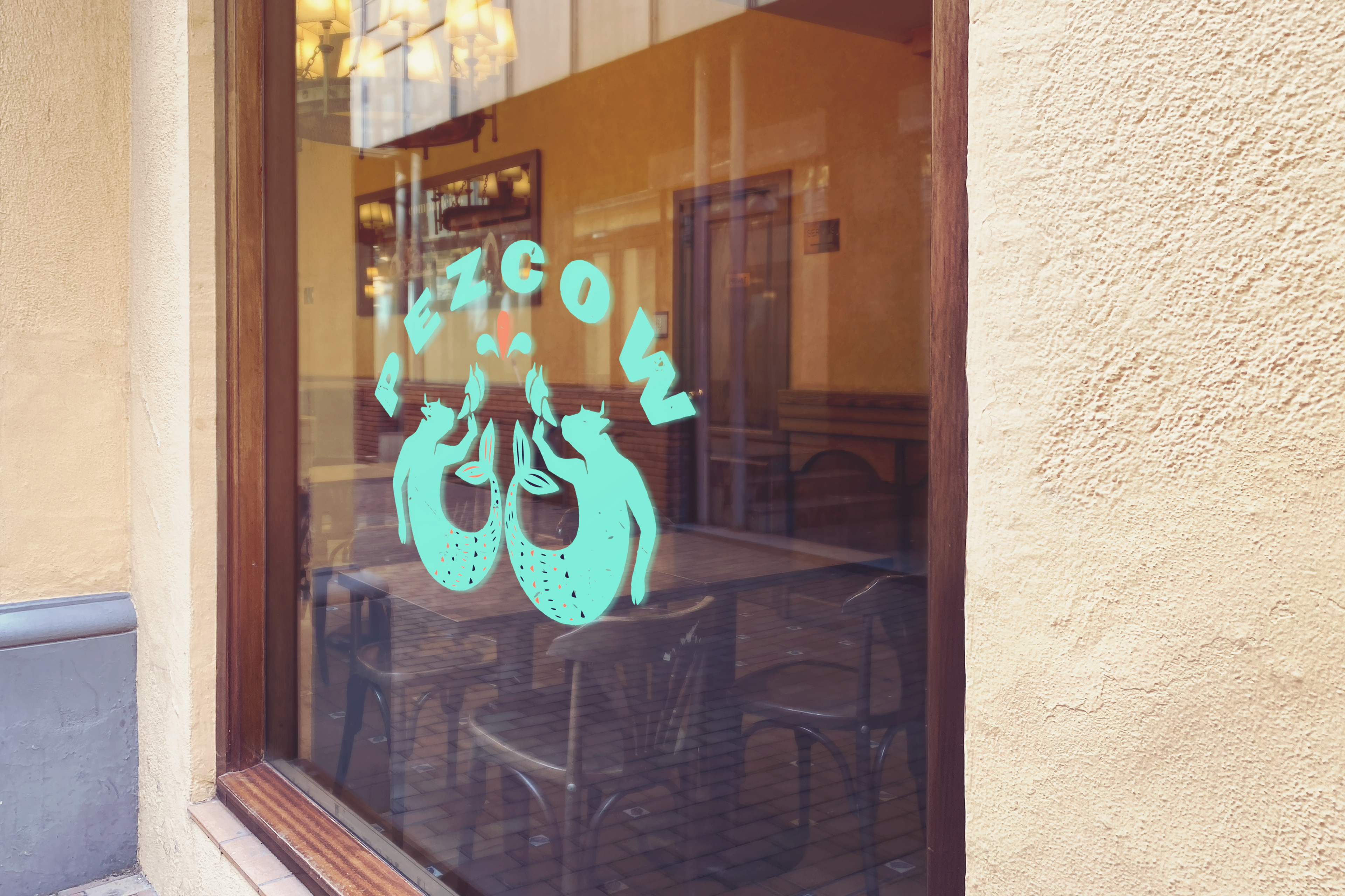
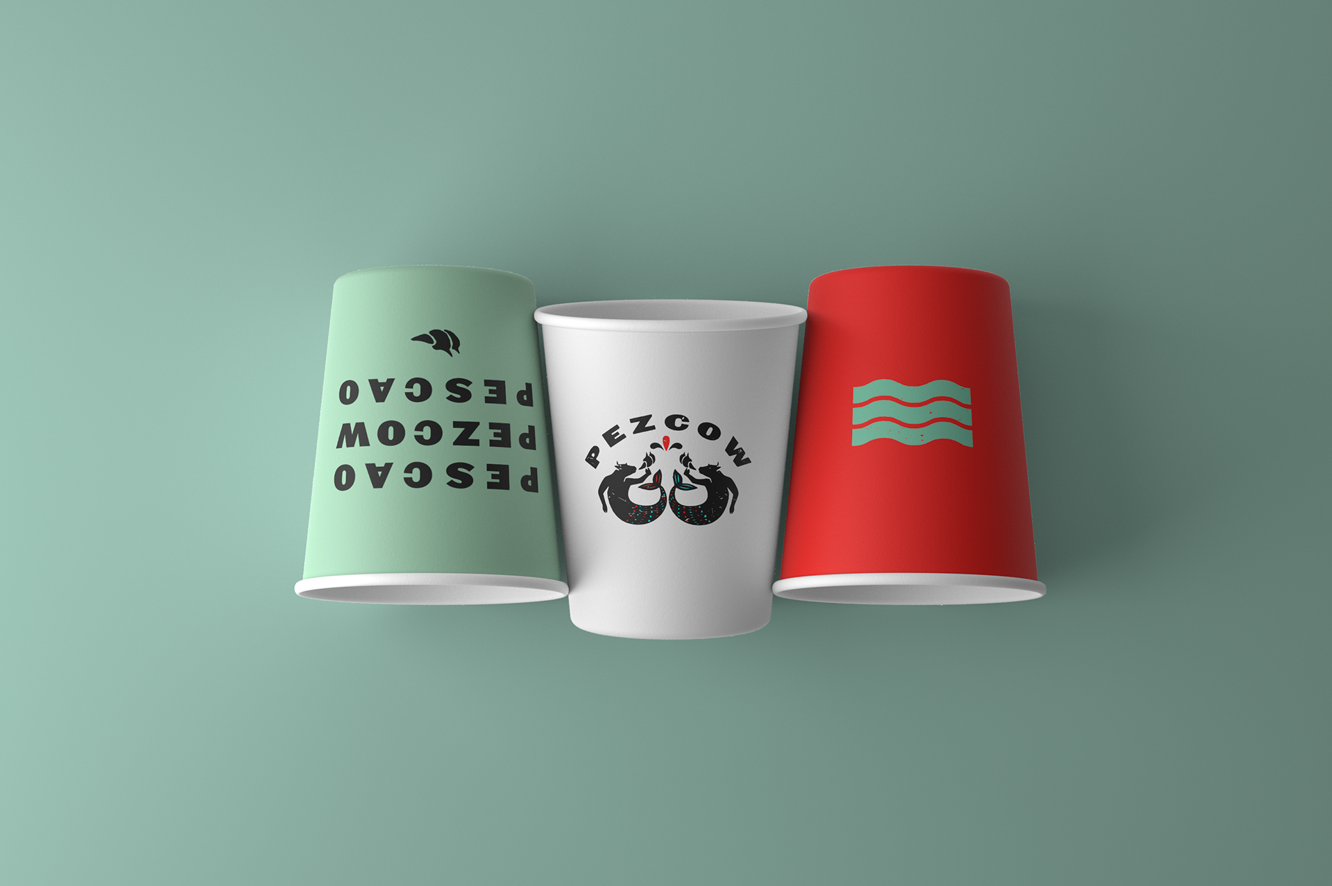
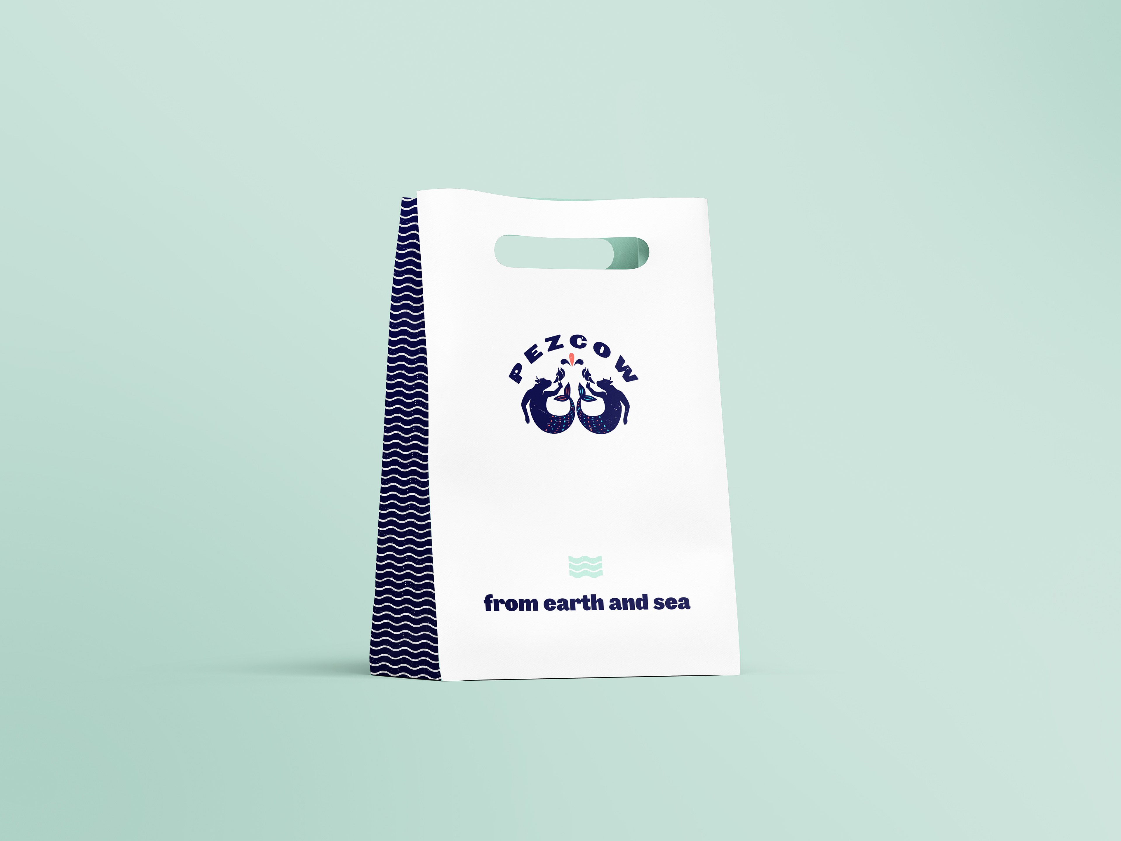
Watza's creative team developed a new name for him, one that merged English and Spanish languages creating Pezcow, a play on words that in Mexico sounds like a very rural way to pronounce fish.
The font and graphics for this brand create a bold, and eye-catching look, yet beautiful and powerful. The color palette is as in the name, and the dishes served at this restaurant, a perfect blend of a turquoise ocean shore and the ocre color of the Northern California land.