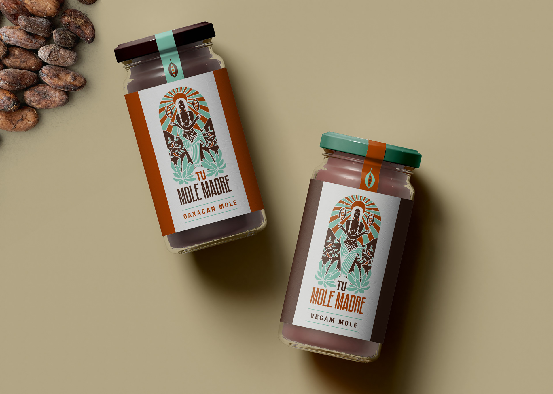
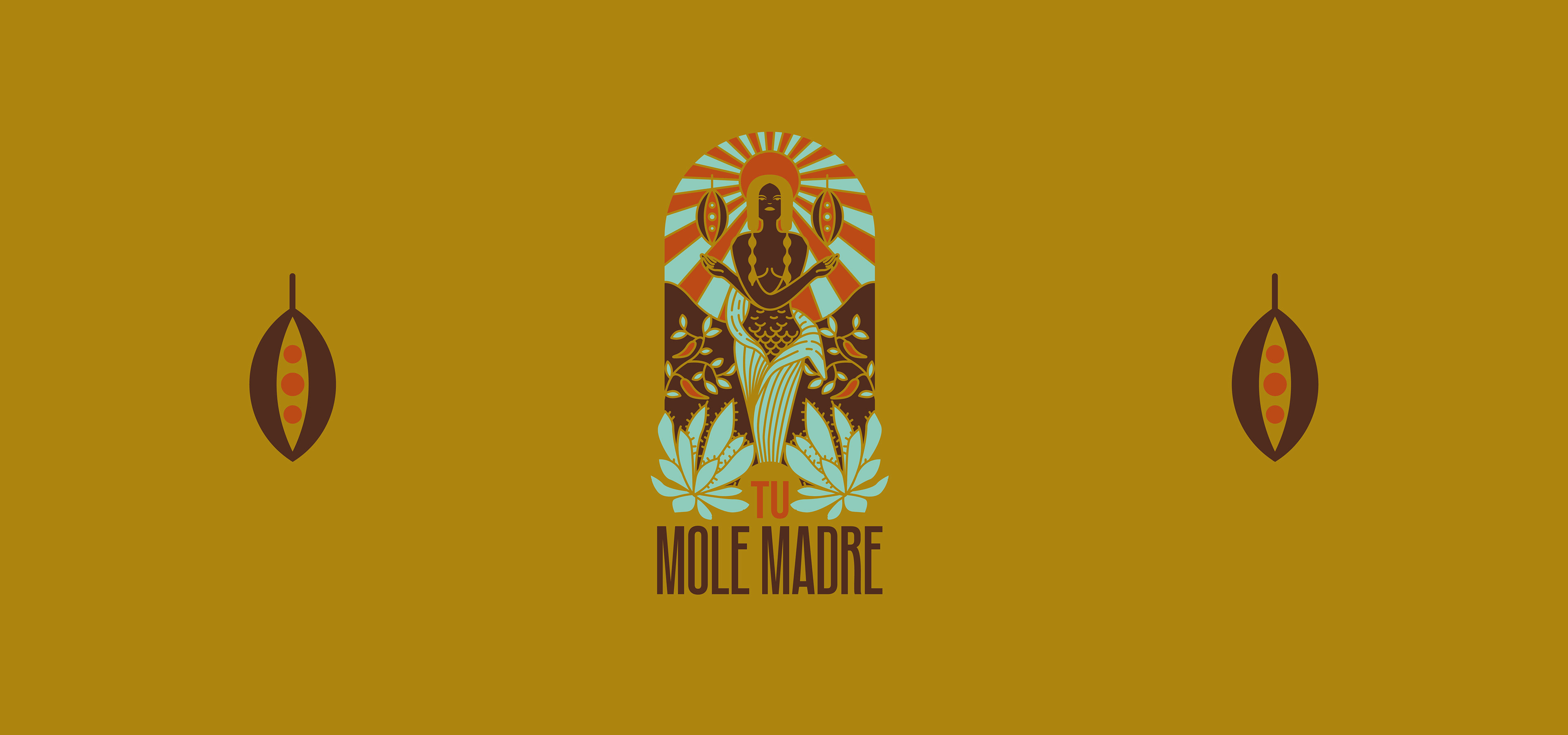
This brand illustrates the goddess of corn: Chicomecóatl as a protective mother of
Oaxacan signature dish: Mole.
Oaxacan signature dish: Mole.
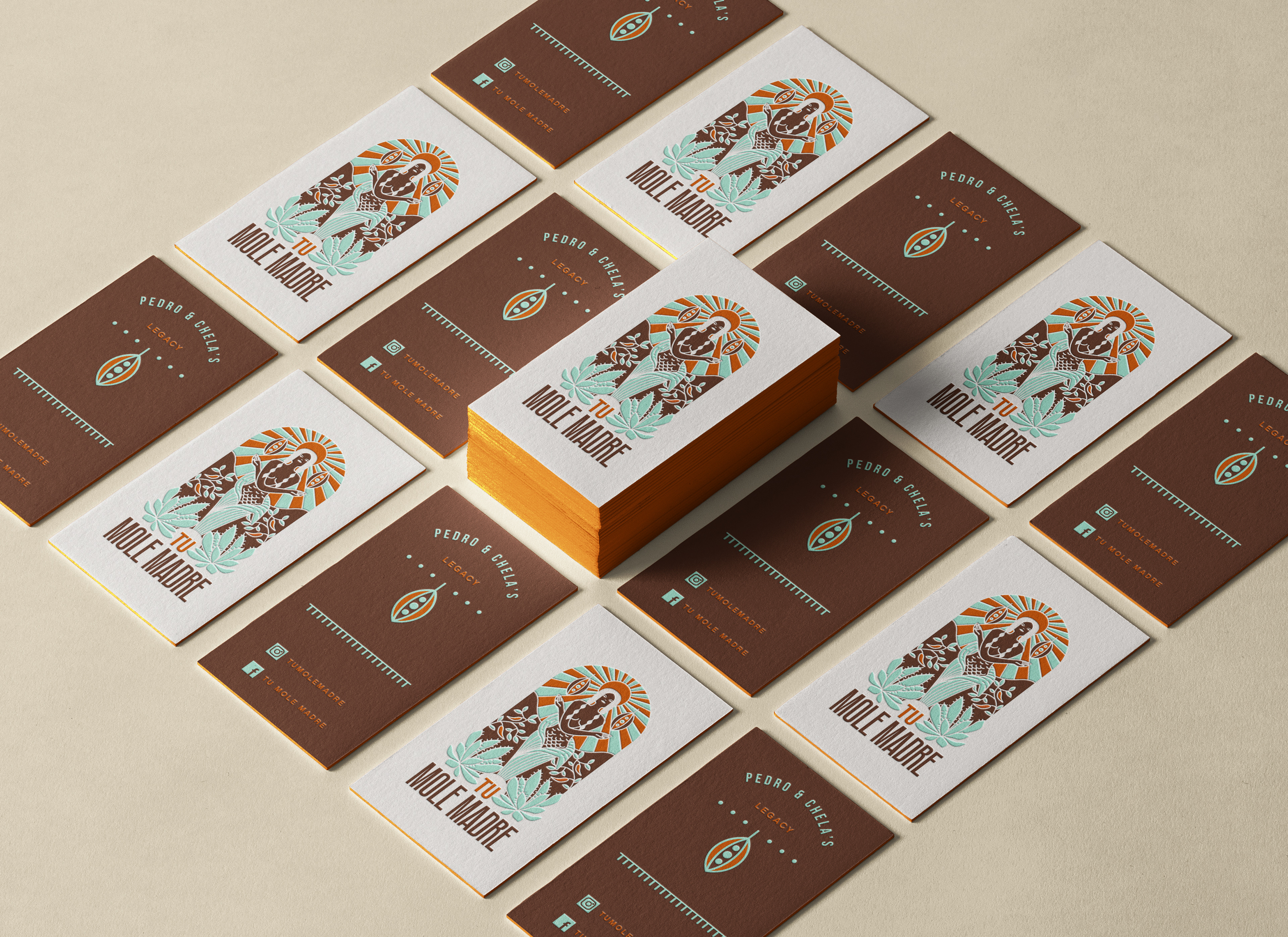
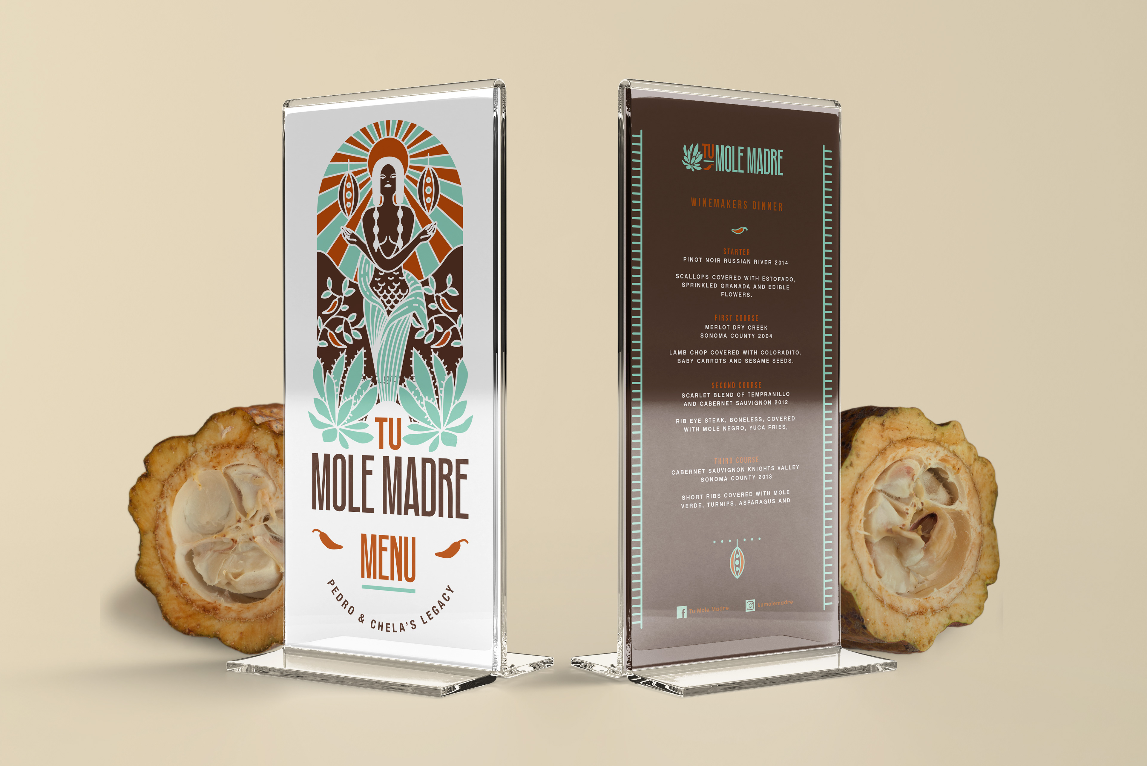
This vertical composition with the incandescent sun of Oaxaca as a background refers to the excellence of the brand, as well as its history and the legacy of the Diaz family in Sonoma County.
Surrounded by symmetry, this logo shows the importance of balance in the kitchen.
A condensed typeface was chosen to accompany this figure of the goddess, reinforcing the
optical illusion of height.
Surrounded by symmetry, this logo shows the importance of balance in the kitchen.
A condensed typeface was chosen to accompany this figure of the goddess, reinforcing the
optical illusion of height.
The three colors — mint, brown and clay — create a contemporary effect of the tones illustrated in ancient Mesoamerican codices.